Flyover
Exploring networks from above

Note: this article is a walkthrough of my thought process in creating the tool. If you like, you can just jump in and play with it.
Alternatively, if you want a concise rundown of the workings, see the project repo.
The Premise
The Internet is big. About 1.7 billion sites by some reckonings, not to mention the massive stores within the data titans (Microsoft, Twitter) themselves. We are accustomed to our own little corners of the Internet, but the world outside is vast. Common Crawl is a nonprofit dedicated to providing the universe of data that is the web to the public without people having to scrape (or browse) it for themselves. They periodically release dumps of the website data they crawl, but also provide a graph of hyperlinks between the websites (where every domain is a vertex, and there is an edge from A to B if there is a hyperlink from A to B).
When I saw they had a graph of the hyperlinks, I knew I had to check it out. So much of what we call reality has representation in terms of connections between entities on the Internet. While connections between people would be best documented in the graph of connections on social network sites, many things – including relationships between businesses, legal/official entities, not to mention the web itself – are best represented in terms of links among the domains themselves. In the hyperlinks, it is all there for the searching.
The Problem
I was curious about how to go about interrogating it, so I shrunk down the graph to one of manageable size (the subgraph of all sites ending in .gov) and set out to do so with what I gathered were the standard tools for interrogating large graph datasets. However, for the questions I wanted to ask, I was unsatisfied.
Questions like:
- What is different about the kinds of vertices connected to this one?
- Which vertices are most representative of them?
- How does this differ at the micro- and macro- levels?
If you have a graph dataset that is not very dense, where there are distinct clusters, a tool like Gephi will lay it all out for you and let you see the shape of things. But, if there is a high level of interconnectivity, where a typical vertex is just a couple hops away from any other, what you get is a tangled mess.
Yet even when a graph is dense with links, there may still be distinct regions of even greater density within it. Community detection algorithms such as modularity maximization are able to pluck these denser clusters from the mesh that nestles them.
However, they take a while to run, then out pops the answer (an assignment of vertices to clusters), and you are left with a snapshot of the graph but not much opening for further inquiry. And so, they are not well suited for interactive exploration.
The Path
I knew I wanted something that would allow me to hone in on a particular vertex, so I started by playing with the subgraph of vertices connected to a given vertex. One thing I tried early on was to do pagerank on the subgraph itself, and look at the top ranked vertices. This more or less proxied the pagerank in the original graph (likely a reflection of its being a dense graph, YMMV). There were deviations, though, so I figured it was an impure proxy, and I sought to distill whatever else there lurking. One attempt was to simply divide the subgraph pagerank by the original pagerank. While it gave interesting results in some cases, in others it yielded high-grade nonsense, the most remote and arbitrary seemeing vertices. I tried calibrating this division in various ways, but it did not really help the situation. After a very dark period in which I slept, I thought to try exponentiation. In particular, exponentiating the original pagerank in the denominator by a sensitivity with 0 <= sensitivity <= 1 as a way of modulating the downweight, since it seemed to be obliterating whatever signal was there. That is, ranking the vertices by:
$where$ $0 <= sensitivity <= 1 $
Experimentally, I found that an sensitivity of around 0.75 gave interesting results for most vertices – though this might depend on properties of the graph (density, etc.). On the other hand, it was interesting in itself to see the results for different sensitivities for a given vertex. Higher sensitivities seemed to give vertices that most represented what was idiosyncratic about the adjacent subgraph (the subgraph of adjacent vertices), while lower sensitivities tended to taper that idiosyncracy, yielding vertices that were more prominent. This makes sense in light of the formula, where a sensitivity of 0 corresponds to unadulterated subgraph pagerank.
Informally, it feels to me like getting at the micro- and macro- structure, respectively, of the graph about that vertex, but I don’t have a precise formulation of this. In lieu of one, I use a metaphor, calling it altitude. In keeping with the metaphor, I map the altitude linearly from (30000, 0) to (0, 1), so that highest altitude = lowest sensivity = least granularity, and vice versa. Since I enjoyed exploring the vicinities of vertices at different altitudes, I thought it would be nice to make an interface for such exploration, and make the altitude a tunable knob.
The Map
For the interface, I wanted something that would allow one to wander the dataset, and see the forest and the trees at the same time. Something that would let one rove the woods, even get lost in them a bit, and then check a map to get their bearings.
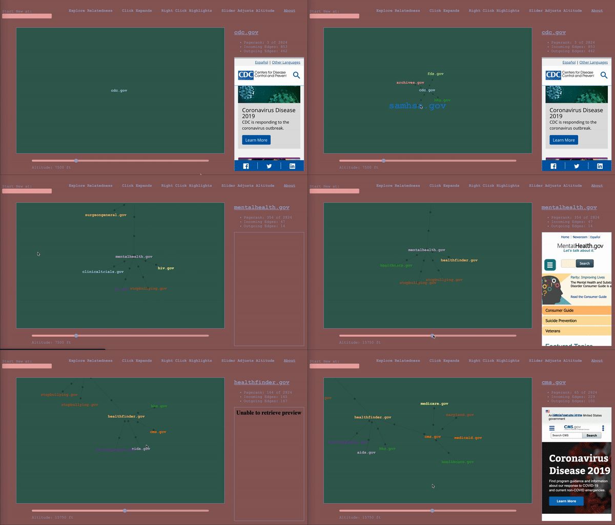
To serve as a map, the it would have to keep track of where the wanderer has been, while also showing nearby territory. The design I settled on ended up being a map that represented the wanderer’s path through the graph as well, a graph (henceforward called map to avoid collisions). The wanderer enters a start vertex, which is presented alone, then whenever they select a vertex, it expands the map about that vertex to include the four vertices with the highest calibrated scores in the adjacent subgraphs (two from the subgraph of incoming vertices, and two from the subgraph of outgoing vertices – yes, this is the first time I am mentioning that bit), according to the altitude/sensitivity. If you click a vertex a subsequent time, it adds four more. Whenever you change the altitude, it replaces each parent vertex’s n childless children with the n with the highest score relative to said parent for the new altitude. Any vertices that been traversed, i.e. expanded, remain as a record of the path of exploration. For the vertices that remain, their originating edges record the altitude at which they were traversed (more dots = lower altitude).
The wanderer will in the course of things occasionally happen upon a vertex they’ve already come across, and this occasion gets its own vertex in the map. When hovering over a vertex, the other sightings are highlighted for reference. I considered having the path connect back to the original sighting, but, with a dense graph, it happens too often and becomes a mess, and then we are back to where we started. It is pretty intuitive as long as you think about it as a map of your path, rather than a one-to-one representation of the underlying graph.
So that is the tool. It is primarily an exploratory one, to ask questions and formulate hypotheses to be subjected to further analysis. It’s also useful for just getting the lay of the land with a graph dataset. It won’t lay it all out for you, but you can get to know the dataset by wandering its forking paths. Details on how to adapt it to use it with some other dataset are on the repo.
The Possibles
-
The thing I am most excited about it to try out the tool with several heterogenous graph datasets and see how it fares and what comes out of it, such as citation networks, twitter mentions, etc.
-
While the user interface was developed with a graph dataset in mind, it is not really dependent on the underlying dataset being a graph. It could just as well be used for any dataset where you have some notion of ‘large near neighbors’ with the slider used to weight the nearness vs largeness accordingly. It could be worthwhile to refactor things to reflect this fact and let people plug in their own functions in a configurable way.
-
While interesting relations can be discovered by using the tool, documenting them is up to the user to do on their own. It would be nice to be able to save a generated map to access later from the UI, create sharable links to maps, and/or export the map in various ways.
-
I started with a few choice small subgraphs of the Common Crawl Dataset. It could be useful to write some tools to allow people to extract subgraphs of their choosing. such as:
- The graph of all sites connected to a given list of sites, (e.g. top Fortune 500 companies)
- The graph of all those within two hops of a given list of sites
- All sites containing a given string in the url
-
There are likely other metrics that could stand in for the pagerank in the computation of the score, and be calibrated in the same way. It would be interesting to try them and compare results.
-
It would be nice to have some kind of theoretical or experimental validation the methods. As of now, there is no other justification than “This seems to give interesting results.” But, I do not know of another thing that measures what I am trying to measure, or even a precise way to stipulate it. However, one possibility would be to generate graphs according to certain parameters where you would expect certain kinds of results, and then validate that those are indeed what you see.
-
Run it on bigger subgraphs of Common Crawl Hyperlinks
Please open an issue or PR with any other suggestions or ideas on the repo!
Acknowledgements
Many thanks to Vasco Asturiano for making the fantastic react-force-graph package that this projects uses.
